Recently, the delightful folks at The Blog Guidebook
held a giveaway for a free button design.
And I won!
My comment was something about winning would be the bees knees.
And you know what?
It was.
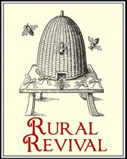
Lyndsay designed two different buttons for Rural Revival
and I had a tough time choosing between the two.
I wonder if she knew how terrible I am with decisions?
Give me a menu with more than two items and I'm in trouble.
Picking a paint shade? I defer to the Artist.
Black vs Brown in my wardrobe has been a lifelong switcheroo.
So two buttons?
Yeah, right.
So tell me, which do you like?
And by you, I mean all of you, frequent commenters, lurkers, friends, Romans, countrymen.
Tell me which one for you, is the bees knees?
~BEE well friends!~


34 comments:
How cool is that? Good for you Andrea :) I have to go with the first one--I love the red border and love the design. The other one is fabulous too but I’m leaning to the first :)
How fun!! I like the second one! :D
They're both as cute as can be, but I'm going with the 2nd one. It grabs me more for some reason.
They're both nice Andrea but I REALLY Like the second one better...it looks more 'country'. But that's just my humble opinion ;) Oh boy do you sound like me and making decisions...brown or black in the closet...paint colours (remember the house colour choice? I still haven't made my mind up!) Oh and CONGRATULATIONS on winning your new tag! Hope your weekend was a good one...enjoy your week!
Maura :)
Me, too! The 2cd one! How adorable :)
Decisions?
Not me.
My Wardrobe?
Black~has been for years. And why not-everything goes together! That way I do not have to make a decision!
Geez. We were split at birth, Andrea!
Thank you for your so sweet comment :)
I hope you are better. I will be soon...
xo, misha
LYLAS!
Like them both but the 2nd one is my favorite:)
Yay for you and your bloggy win:))
Hooray for you!
I am not a great maker of decisions...I like both of them, but the second one kind of grabs me!
Well shoot! I went snoopin with your link and came back and lost my comment. Hope you don't get two comments! I like the second one Andrea. I love the print and the little bees on it :) Congratulations to you!
Hee hee...I so agree! My closet is basic black and navy! And yep...number 2 is my favorite. What fun, congrats! -Mary
I hope you like number 2 Andrea because that seems to be the main winner...that is the one I like also.
I think it really depends on the look you are wanting. I like the friliness of the first one but I really like the simplicity of the second one. I don't think you can loose with either of them because they are both really good.
Me too for number two!!!! It has a cleaner look to me and the cream is a great contrast with the black and red. Congrats for winning!
I like the second one with the bee skep...nice simple design. Congrats on winning!
Congrats on winning! Both of them are pretty, but I like the second one better.
I like number two better I think.
I'm in favour of the first one but both are lovely!
I won a giveaway recently and was told I could choose anything from a site - my response was just don't send me anything pink. Too many choices for me.
I like them both but would use number 2 most often.
Oh how fun!!! The second one is my fave by far, although both are just over the top cute.
The shelter told us Hannah may have a bit of German Shorthair Pointer and English Springer Spaniel? Your guess is as good as mine. :o)
Hi Andrea ~ Congratulations! I prefer #1!
Congratulations to you!!! I like the second one and the way it just pops off the page!
God bless and have a beautiful day sweetie!!!
Giveaway...my place! :o)
I like 'em both, but number one is more whimsical - I like that. So pretty!
I agree that they are both lovely, Andrea, but I'm voting for the second one also. I like that it is simpler, a bit more country looking.
I like them both but adore #2. Congrats!!
Staci
How cool is that! My favorite is the little wicker bee skep. It looks so old fashioned and I love it.
I adore the second one!
What a great win, congratulations Andrea. I like them both, but number two would be my choice. Two is a little less formal, what can I say I am just a simple kind of gal!
I like the bottom one, the amber color just looks more homey!
I think you may have to go with the favored number 2! It does seem to be fitting for your blog... I do however love the curly, twirly border on number one!
~Chris
I love #2!!!
I don't know how you can choose. They are both so great! I've always wanted my own button too! I would have to vote for the second one. While the first one is equally great, I like the font on the second one a little better! Good for you!
I like the 2nd one
Yay you! I vote for the 2nd.
hugs,
Leslie
I really like #2!!!!
I like the 2nd one the best!
Post a Comment